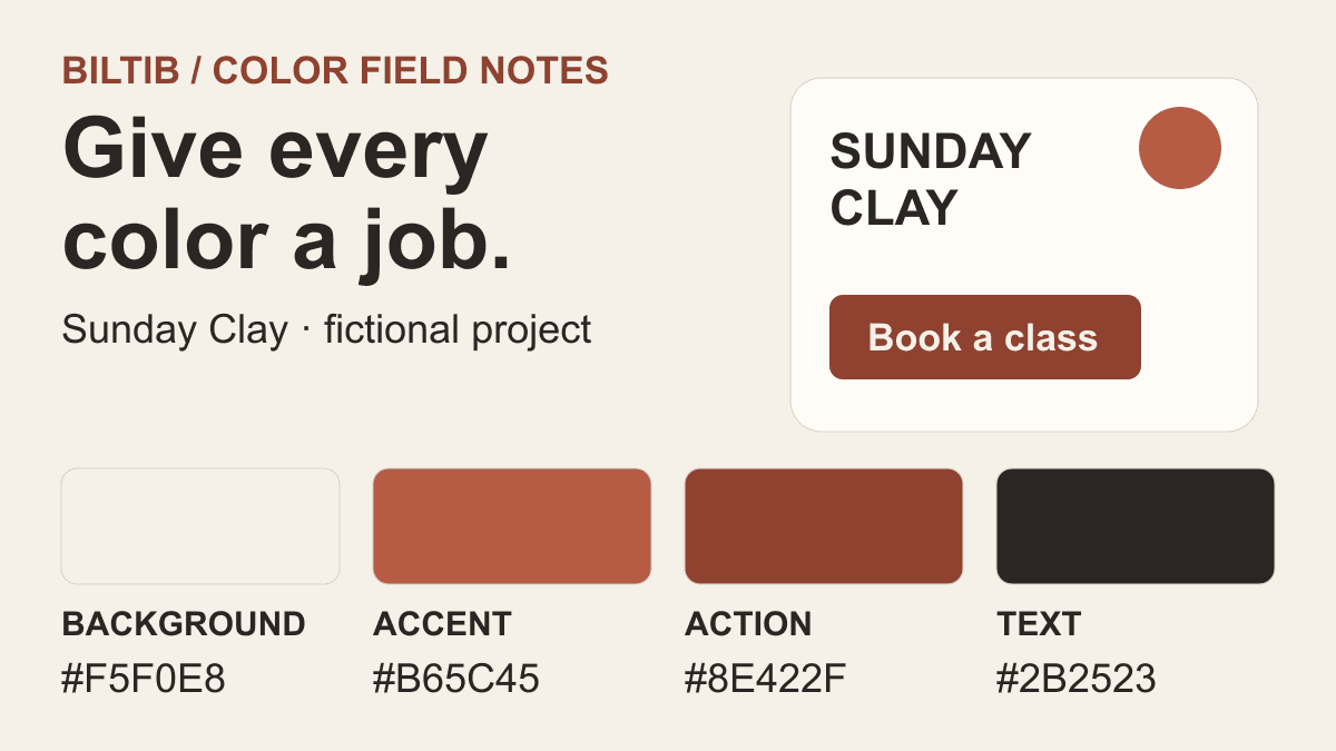
Sunday Clay is a fictional project. The hero and all ten inline diagrams are original Biltib illustrations.
A row of beautiful colors can still leave you staring at an empty canvas. Which shade becomes the background? Can the accent carry a small label? And does the combination feel the same when one color fills most of the page?
The useful question is what you need to do next. Some tools help you discover a direction. Others generate variations, sample an image, preview a layout, or check a specific foreground and background. Treating them as different jobs makes this shortlist easier to use.
We will continue Sunday Clay, the fictional ceramics workshop from our moodboard guide. Its starting colors are chalk #F5F0E8, clay accent #B65C45, dark clay #8E422F, and ink #2B2523. These are editorial choices for an example, not a ready-made accessible brand system.
If your references still feel scattered, make a moodboard first. If you need source material, our websites like Pinterest guide covers places to collect it. Then choose one small thing to make, such as a workshop card, instead of designing an entire identity at once.
Build a direction from your saved referencesUse a moodboard to connect inspiration with the next design decision.Find places to collect visual inspirationExplore seven alternatives for discovering and saving creative references.Discovery: find a direction
1. Color Hunt: find a direction worth exploring
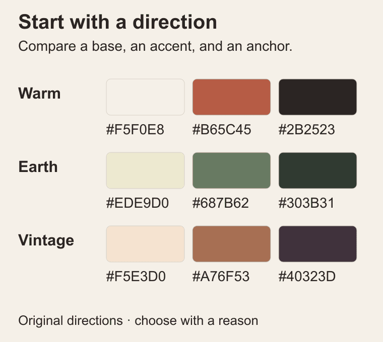
Color Hunt is a curated collection of palettes submitted by its users. Browse categories such as Warm, Earth, or Vintage when you know the atmosphere you want but have not settled on individual colors. It is a discovery resource, rather than a generator that solves a particular layout.
For Sunday Clay, compare a warm direction with an earthy one. Look at the lightest and darkest swatches as carefully as the memorable accent. A palette with several medium tones may feel cohesive while giving you little separation for readable text.
Save two candidates and write a reason for each: softer background, stronger hierarchy, or a useful material reference. That note is more valuable than collecting another twenty combinations. Our diagram shows original editorial directions, not palettes copied from Color Hunt.
Extraction: start from an image
2. Adobe's image palette tool: sample your own reference
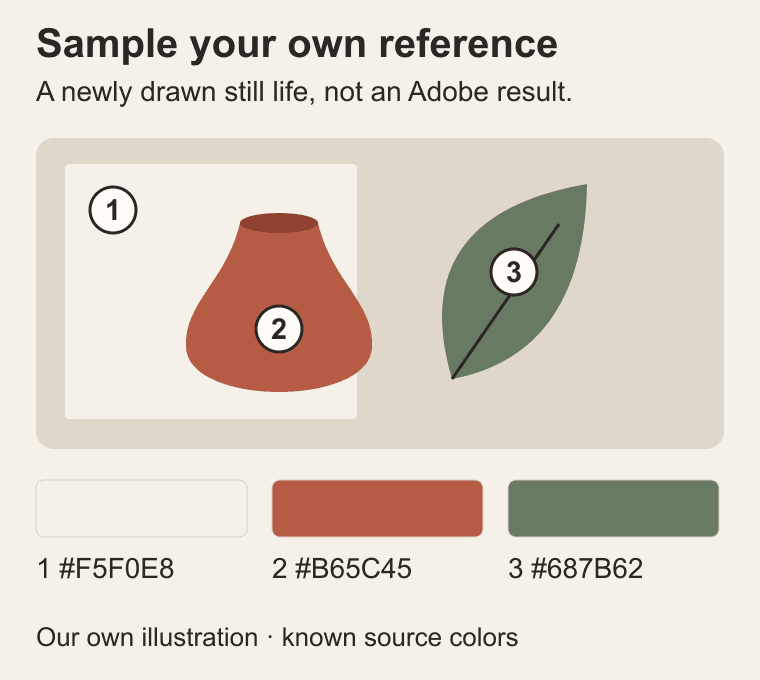
As of 1 October 2026, the image palette tool at color.adobe.com is presented as an Adobe Express tool. Upload an image, let it identify colors, then move the selection handles to refine the swatches. It provides color values you can use in a design; automatically applying palettes to designs in Express requires a paid plan.
Use a reference you made or have permission to upload. For this guide, we drew a new flat-color still life with a terracotta vessel, paper, and a leaf. Its sampling marks illustrate the idea, rather than recreating Adobe's interface.
Sampling a photograph needs more judgment. A shadow may produce a useful text color, while a highlight may be too pale to carry information. Keep the link between swatch and source visible, then adjust the extracted colors for the job instead of treating every sampled pixel as a brand rule.
Generation: explore with constraints
3. Coolors: keep one color and vary the rest
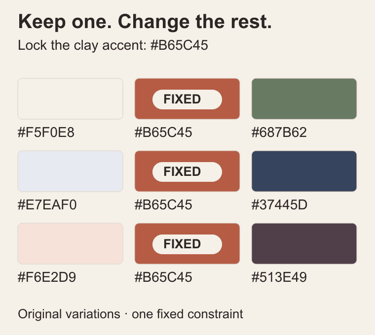
Coolors is useful when one color is already decided. Its generator lets you lock a swatch and generate alternatives around it; the spacebar makes exploring successive combinations quick.
Lock Sunday Clay's #B65C45 accent, then compare possible backgrounds and supporting colors. Change one decision at a time. If every swatch keeps moving, it becomes difficult to explain why the new version is better.
The diagram illustrates that process with Biltib's own combinations; it is not a captured Coolors result. Check the current pricing and export options before committing to a workflow, because account limits and paid features can change. A locked swatch is a constraint, not a guarantee that the resulting text colors will pass contrast checks.
4. ColorSpace: branch out from a starting HEX value
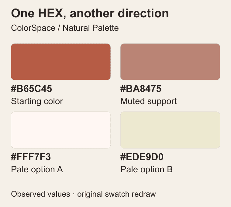
ColorSpace begins with a single color and generates palette options around it. This makes it a convenient next stop when your shortlist has one convincing anchor but the supporting colors still feel arbitrary. Enter a HEX value and compare the different families of results.
In a browser check on 1 October 2026, #B65C45 produced a Natural Palette containing #B65C45, #BA8475, #FFF7F3, and #EDE9D0. The illustration redraws those four values as labelled swatches. Treat the result as a proposal to evaluate, not a recipe that must survive unchanged.
For a workshop card, the two pale colors might compete for the same background role. Choose the one that works with your photography, then bring in a separately checked dark text color. Generating a pleasing family and completing a usable interface are different steps.
5. Paletton: explore the relationship between hues
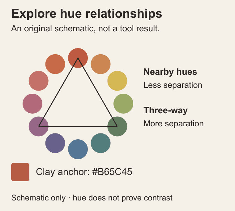
Paletton suits a more deliberate exploration of color relationships. It uses an artistic RYB color wheel and supports palettes of one to four hues with five shades each. Monochromatic, neighboring-color, triadic, and other arrangements give you different starting structures, alongside previews for layouts and other uses.
Try a restrained family first, then a more separated set. For Sunday Clay, an additional cool hue might distinguish a notice or illustration detail, but it should earn its place in the design.
The interface is denser than a simple palette gallery, so arrive with a question: do I need variation within one family, or a distinct supporting hue? Our wheel is a schematic explanation of relationships, not a screenshot or an exact Paletton output.
6. Huemint: generate with layout roles in mind
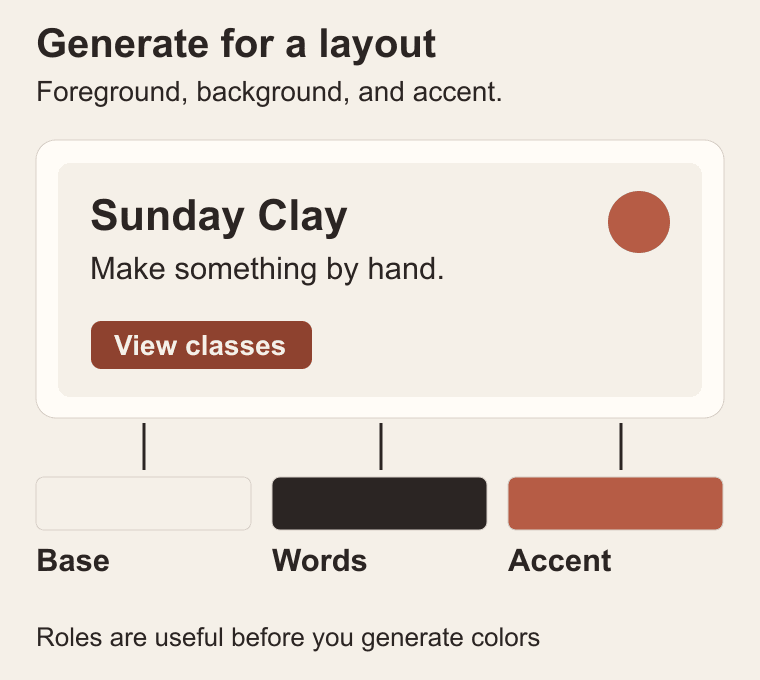
Huemint generates colors with an intended use in a design, including background, foreground, and accents. Choose a template, lock a color you want to preserve, and generate alternatives. Its creativity control lets you explore results that are more typical or more varied.
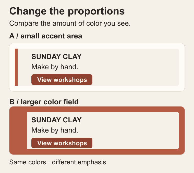
This is useful when a flat strip keeps misleading you. A color that occupies a small accent area can feel very different when it becomes the page background. Start with a template close to your actual job, then assess the hierarchy of its main elements.
There is an important distinction in Huemint's controls: its contrast matrix uses CIE Delta-E color distance, not WCAG text contrast ratios. Do not read a high matrix value as an accessibility pass. The role diagram below is our own explanatory example, and the finished foreground/background pairs still need a dedicated check.
Layout previews: give colors jobs
7. Happy Hues: see where the colors go
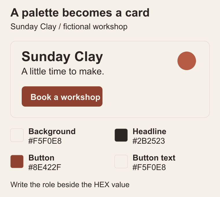
Happy Hues puts selected palettes into a designed page and labels uses such as background, headline, button, and button text. That makes it helpful when you like a combination but cannot yet translate it into a composition.
Study the assignment of roles rather than copying an entire page. In our original Sunday Clay card, chalk carries the background, ink carries the main information, and dark clay carries the booking button. The original clay remains a decorative accent.
This distinction is worth recording beside the HEX values. A teammate receiving only four swatches has to guess which ones belong together. Someone receiving background, body text, button, and button text can build a consistent first draft. Use the site's visual examples for context, then check your actual pairings and content.
8. Realtime Colors: compare proportions on a page
Realtime Colors previews text, background, primary, secondary, and accent colors across a sample website. You can also explore fonts and export choices in formats including CSS and SCSS.
Use it to ask a compositional question: how much of each color should the viewer encounter? Our comparison uses the same Sunday Clay colors in two different arrangements. One gives the accent a small supporting area; the other makes it a large surrounding field.
Neither proportion is a universal rule. Decide which version gives the workshop details the right emphasis. Then check the design at a narrow width, where columns stack and color areas change shape. A palette that works in a desktop hero still needs to support a readable mobile card.
Contrast: check the actual pairs
9. Leonardo: work toward explicit contrast targets
Leonardo is Adobe's open-source tool for generating colors around desired contrast ratios. It is useful when you need a repeatable scale or an adaptive theme rather than one attractive combination. It also offers visualizations and outputs for carrying colors into a design or implementation workflow.
Start with the surface the colors must sit on and the contrast relationships you need. This is a more technical task than browsing a gallery, so a small brief helps: supporting text, strong text, and a distinct action color are clearer requirements than five harmonious swatches.
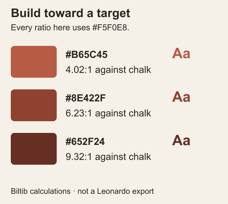
Our illustration contains independently computed example colors against chalk, with their actual contrast ratios. It demonstrates the principle of checking a target; it is not a Leonardo export. When you change the background, recompute the pairs instead of assuming an old ratio follows the foreground color everywhere.
10. Color.review: check the pair that carries the words
Color.review focuses on the relationship between a foreground and background, with a shareable check for a pair. Use it when you have chosen roles and need to inspect the combination that will actually carry the words. A palette as a whole never automatically passes accessibility.
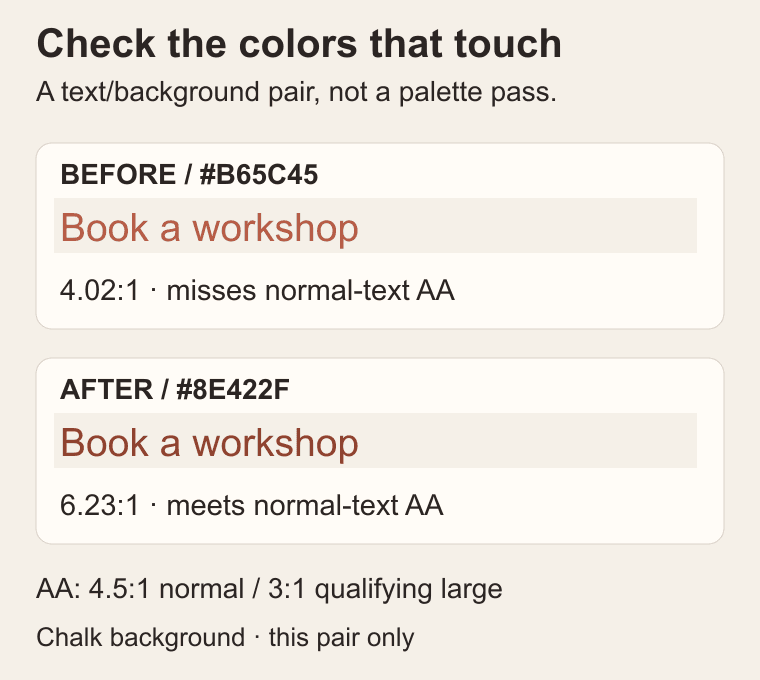
For Sunday Clay, clay #B65C45 on chalk #F5F0E8 measures about 4.02:1. Darkening the foreground to #8E422F gives about 6.23:1; ink #2B2523 gives about 13.30:1. These figures were calculated from the sRGB values using the WCAG relative-luminance formula.
WCAG 2.2 AA normally requires at least 4.5:1 for text, or 3:1 for qualifying large text: at least 18 point, or 14 point bold. Clay therefore misses the normal-text threshold on chalk. Dark clay clears that specific check. The rounded figures are for display; threshold decisions use the unrounded calculation.
Make the palette earn its place
Take one candidate into a real piece of work. For Sunday Clay, make a card with the workshop name, a short description, a date, and one booking action. Give each color a role before adding decoration. Keep the text/background pairs in a small handoff note beside the HEX values.
Check the small practical details next: links, button labels, muted text, and text over images. Test actual font sizes and states. A contrast ratio answers one question; it does not check keyboard focus, information conveyed only by color, or the rest of a usable interface.
If the card feels flat, adjust the balance of space and color before adding more swatches. If it is difficult to read, improve the relevant pair. Return to a generator only when you can name the missing decision. The stopping point is a palette that helps you make the next piece, with choices another person can understand.
About this guide
Product pages and official documentation were reviewed on 1 October 2026. This is a researched selection, not an exhaustive hands-on benchmark. Sunday Clay is fictional. All eleven illustrations are original Biltib diagrams; schematic examples are distinguished from observed tool values. Contrast examples were independently calculated. Product features and plan availability can change.
Turn your moodboard into a finished piece
Use the free Sunday Clay kit: a worked example, checked color pairs and two blank worksheets. Download the PDF or editable Excalidraw board without signing up.
Free design kitGet the free Moodboard to Finished Design kit